MIT Weblab笔记 - HTML & CSS Basis
Introduction
HTML provides the structure of the web pages, while CSS is used to control the layout of these pages.
HTML
Structure
1 | |
<head>contains meta-information about the document, such as its title, link to CSS files<body>contains the content that will be displayed on the web page.
Syntax
Headings
<h1> to <h6>.
Paragraphs
<p>, start on new line.
Divisions
<div>, represents a block-level portion of a document such as a few paragraphs, or an image with its caption. Starts on new line.
Sections
<section>, is used to group meaningful components, like introduction, about, ,etc. Starts on new line.
Spans
<span> represents an inline portion of a document, for example words within a sentence.
Lists
Unordered Lists
1 | |
Ordered Lists
1 | |
Links
1 | |
Images
1 | |
Relative Path
A relative path points to a location that is relative to the current file’s location.
- Current Directory (
./). It refers to the folder that contains the current file you’re working on. e.g.<img src="./image.jpg">, image.jpg is in the same directory as the HTML file or the script calling it. - Parent Directory (
../)
CSS
Types
Inline CSS
Using the style attribute:1
<h1 style="color: red;">This is a heading</h1>Internal CSS
Define within a<style>tag inside the HTML document’s<head>section:1
2
3
4
5
6
7
8<head>
<style>
p {
color: green;
font-family: Arial, sans-serif;
}
</style>
</head>External CSS
Define in a separate file:1
2
3<head>
<link rel="stylesheet" href="styles.css">
</head>
Syntax
Import fonts from https://fonts.google.com/.
1 | |
Global Definition
Root variables, defining CSS custom properties (variables) for colors that can be reused throughout the stylesheet. Other parts of the css file can use it by var(--grey).
1 | |
Element
The style defined here automatically applies to the entire body of the document (inside <body> and </body>).
1 | |
Class
Style for class. <div class="navTitle">. An element can have multiple classes. Can use the same class on multiple elements.
1 | |
ID
Style for ID. <div id="unique">. An element can only have one ID. ID must be unique in any give HTML document.
1 | |
Style Rules
Priority:
- Inline Style
- ID Attributes (
#unique {}) - Classes (
.container {}) - Elements (
div {})
Formatting Techniques
The Box Model
- Margin: the space outside the element’s border.
- Border: border surrounds the padding of the element.
- Padding: the space between the element’s border and its content. It creates space inside the parent element, around the content area.

Margin and padding are transparent. Width and height are dimensions of the element.
1 | |
To inspect an element’s box model and other detailed attributes:
1. Open the browser
2. Inspect
3. Command + Shift + C
4. Click on the element to inspect

Margin Ordering
Margin orders in the sequence of top, right, bottom, left
- margin: 10px;: All sides 10px
- margin: 10px 20px;: top and bottom 10px, left and right 20px
- margin: 10px 20px 30px;: top 10px, right 20px, bottom 30px, left 20px
- margin: 10px 20px 30px 40px;: top 10px, right 20px, bottom 30px, left 40px
Positioning
In HTML, elements are typically laid out according to the normal document flow. This means they appear in the order they are defined in the HTML. If we want to explicitly set an element’s position, we can use the top, bottom, left, and right properties. However, these properties will not work unless the position property is set first.
- static: Default, position in document flow
- relative: Position relative to default position via top, right, bottom, left properties
- fixed: Position relative to the viewport, which means it always stays in the same place even if the page is scrolled
- absolute: Position relative to the nearest positioned ancestor
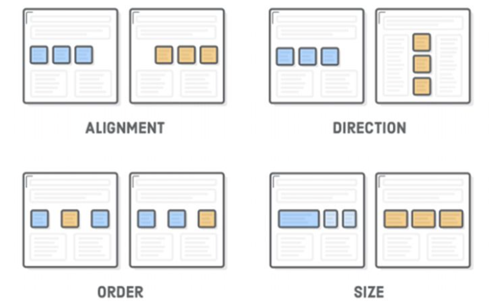
Flex
Flex is a flexible box. It can control direction, sizing, distribution. All direct children of a flexible container becomes flexible items. See this flex demo.
An example flex container defined in CSS:
1 | |
Order
1 | |
Sizing
Make the third flex item grow 2 times faster than the other flex items:
1 | |
Set the initial length of the third flex item to 200 pixels:
1 | |
An example of horizontal direction: The two sections are now in a row and evenly distributed in the flex container.
1 | |
1 | |
